UX/UI CASE STUDY
Les Fermes Du Marché
An Online Farmer's Market That Connects Urban Population With Local Montéal Farms

MY INDIVIDUAL CONTRIBUTION
In April 2022, the founder of Les Fermes du Marché, an online farmer’s market based out of McGill University, reached out to me and requested that I design their virtual online shopping platform entirely from scratch. I was hired as the only designer in the company, working under and reporting directly to the CEO. Since this company was newly founded at the time I was hired, I also assisted in developing its branding strategy and guidelines.
MY ROLE
-
UX Researcher
-
UX/UI Designer
DURATION
April 7-17, 2022
10 Days
STAKEHOLDER INTERVIEW
Understanding
The Company
01. What are the goals, values, and vision of your company?
02. What problems does your product trying to solve?
03. Who are your users or customers?
04. What do you know about your users
05. Who are your major competitors?
06. Do you have brand guidelines?
07. What are your unique selling points?
08. How will you, personally, define the success of this project?
09. Are there any technological or design constraints?
10. What are the deadlines for this project?
QUESTIONS:
KEY FINDINGS
The Problem
The Mission
Target
Audience
Major
Constraints
The food market is expanding as the client speaks to the E-commerce world. However, not everyone has the resources and abilities to direct and build such a platform. Also, farms and agro-business want to remain in control of their branding and images but are often lacking the time to operate a selling platform (physical or virtual). This lack of time often leads them to sell to another platform that is buying their products. Generally, it is estimated that 50-40% of the cost paid by the consumers goes to intermediate partners.
The platform is here to help the farmers rather than sell for them. Our approach allows them to stay in control of their brand and still expand their clientele reach.
People of all ages, genders, professionals, basically all the active grocery shoppers in the Montreal area.
University students are of special target.
Limited Time
The complete project was due in 10 days
Limited Budget
As a newly founded company, Les Fermes du Marché does not have the budget and resources to conduct user interviews and user testings.
THE CHALLENGE
How might we design a user-friendly farmer's market that suits the client's vision without conducting user research that involves real users.

Research
CHAPTER 1
Although we do not have the budget to conduct user interviews and surveys, there are still many research methods out there that can be used to identify the best practices to optimize a site's user experience.
COMPETITIVE ANALYSIS
Understanding the Competition
FEATURES
Bilingual
Newsletter
Since Les Fermes du Marché is only targeting the Montreal population, there are only two major competitors - Lufa Farms and Maturin, according to my client.
Since this virtual farmer's market is only targeting the Montreal area, there are only two major competitors - Lufa Farms and Maturin, according to my client.
Blog
Recipe
Product Review
Farmers's Booth
Farm Description
Related Product
Brand Identity
UI Design
Locating the Booth

Strong
Crowded
Difficult

Weak
Crowded
Difficult
OPPORTUNITIES IDENTIFIED AFTER CONDUCTING COMPETITIVE ANALYSIS
Along with including all the features found in both of our competitors' websites, we believe that creating a user-friendly interface, developing a strong brand identity, and making it simple for users to find each farmer's booth are essential elements in setting our website apart from the competition.
SECONDARY RESEARCH
Understanding Common User Pain Points In Grocery Shopping
Since our target audience is basically all the active grocery shoppers, common user pain points in grocery shopping experience have considerable value of as sources of reference.
Clean Interface
Many users find most grocery shopping websites' interfaces to be busy and therefore distracting, packed with too many promotional materials.
Fast Checkout
Slow-moving checkout process has led many users to abandon their carts without making a purchase.
Relevant Information
Many users are troubled by the lack of enough product information online. The absence of relevant information has prevented lots of users from making crucial decisions while shopping online,
Proper Filtering Options
The lack of proper filtering options is another major pain point that users face. Most eCommerce stores lack category-specific filtering that hampers the decision-making process of shoppers.
Translation
Many users find some local Montreal online stores operate their websites only in the language of French, which is a big issue for those English-speaking shoppers.
Diverse Payment Options
The wide range of online products can excite potential buyers, but they might not necessarily buy them due to restricted payment options.

Design
CHAPTER 2
After the research phase, it is time to start design. However, design is not just about what it looks, but more importantly, how it works. Therefore, when I begin the design phase, I always make sure that I focus on the user experience first before getting into all the design details.
INFORMATION ARCHITECTURE
Forming the Base
I started the design process first with creating an information architecture for the website. Before doing this, I had carefully studied and understood the roadmap my client provided me at the beginning, as well as making all the necessary revisions to ensure the best user experience. During this process, I made sure that I had been keeping my client's vision and all the research findings in mind.

USER FLOW DIAGRAM
Mapping Out
the User Experience
Creating an user flow diagrams was indispensable in the ideation process. It allowed me to understand how will users interact with the website and the steps they might take to complete a task or achieve a goal.
.png)
SKETCHES
Getting the
Skeleton Right
I sketched the main pages of the website before getting into all the design details. Sketching first allowed me to gain an intimate insight into what layouts would work before getting digital.


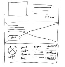


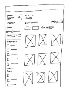
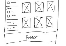
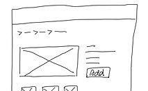
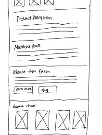
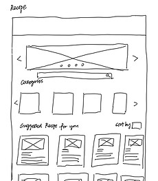
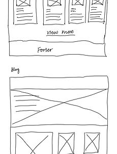
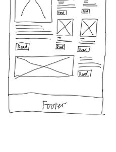
Due to time constraints, I decided to go directly from sketching to high-fi prototypes
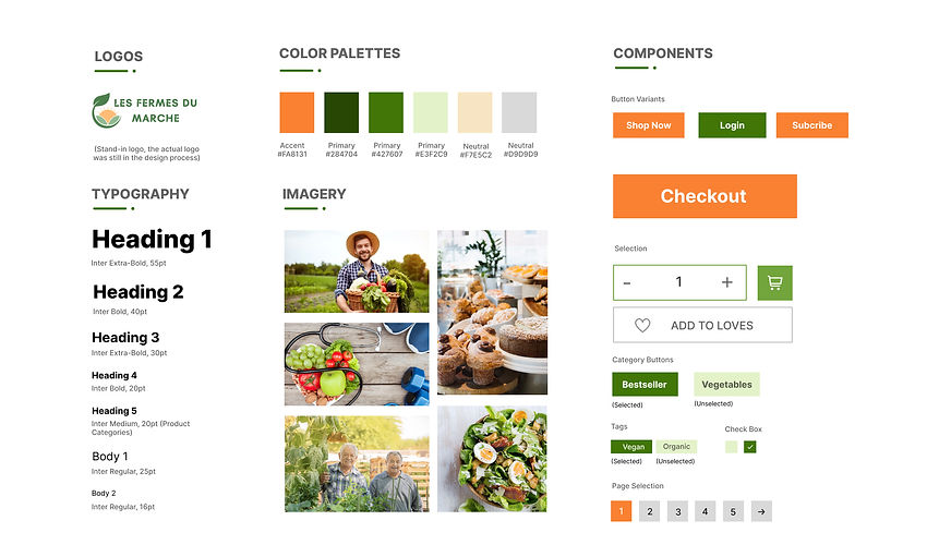
STYLE GUIDE
for consistent UI and strong brand identity
Unexpected Project Termination
Unfortunately, halfway through my design process I was notified by my client that she had decided to build the entire website using an online website builder and its pre-designed templates, as she later realized she could not afford to hire a developer to build a design from scratch. Although I was paid the money written in the initial contract, my design would no longer come to real life.
But here are all the designs I have done!
